Illustrator CS4 Design Example of Polaroids on a Page
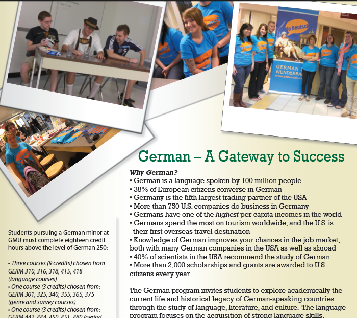
The joy of my girlfriend being a teacher is that schools try to do things and have no resources to do them. Is it bad management? Oh yeah. But what are we going to do? Let kids suffer because people are lazy and inefficient? I digress. My point was that I often get dragged into doing little projects for free for my girlfriend because of lack of resources (see German Events for examples of a “small” project I got dragged into - which included that website). I don’t usually mind, since it keeps her happy. This most recent one was a flyer to encourage freshman to pursue German language at George Mason University. It had a cool effect that I had sorta seen before with polaroid pictures represented as marketing material.
If you want to check out the flyer, and how it can turn into something cool, here’s the PDF: GermanFlyer-web. This will give you a way to do it yourself, should you like this design and want the “polaroid effect” on a flyer of your own.
-
The first thing I would suggest anyone doing in Illustrator is getting your Layers in order. You can open your Layers Window by hitting F7 or going to the “Windows” menu item and selecting “Layers”. First thing you should do is to adjust the default layer by double clicking it to “Background” and create a new Layer called “Foreground”.
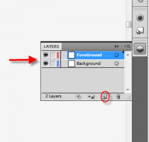
figure 1.1 Create Layers
-
Make sure that your “Foreground” layer is first in the list by dragging your layers around. This is because this determines order of how things are drawn on your canvas, and you want your foreground on top.
figure 2.1 Constrain Proportions
-
Make sure that the “Foreground” Layer is selected and Drag and Drop a picture into Illustrator. In this example, I’m just dropping a Public domain image of Yosemite on the canvas.

figure 3.1 Change Width
-
Once Illustrator has imported the picture, select the picture and constrain the propertions. This will make sure your picture doesn’t get overly skewed. Once you have selected the Constrain, resize the Width attribute of the picture to 250 px. This should be a much more reasonable size to work with now, so reposition it somewhere on your canvas.
-
Making sure that the “Foreground” layer is selected (again), select the “Rectangle Tool” and make sure the background is set to white (I’m going to assume you want the polaroid look to have a white background).
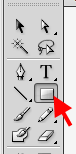
figure 5.1 Select Rectangle
-
Make a Rectangle over your image (so you can’t see it anymore).
-
This time, unconstrain the proportions of the rectangle that you just created, and resize this to 280 x 260. Position this over your image again.
-
Open your Layers window again and select your newly created Rectangle Path.
-
Double click on the Gradient button to adjust the current fill for that object.
-
Select the gradient type “Linear” and use a light gray color (something like xCECECE or 14% for all CMYK values) for the darker side, and white for the other by clicking on the color box under the gradient line.
-
Adjust the slider so that it starts somewhere around the middle (depending on how you want to do your virtual “lighting” on the document. By default - the middle is the easiest to manage).
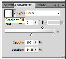
figure 11.1 Adjust Gradient
The resulting object should be something like the following:
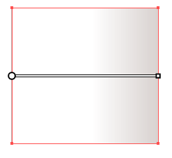
figure 11.2 Gradient Example
-
Open the Appearance Window (Shift-F6 or Menu->Windows->Appearance) Click on the “Add New Fill” button - This will create a copy of your current fill, so you can have multiple if you’d like.
-
Select the newly created Fill.
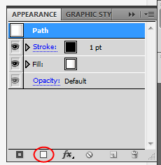
figure 13.1 Add New Fill
-
Open the Gradient options by double clicking on the Gradient button again. Change the type of this fill to “Fade to Black”, adjust the colors to the color gray and reverse the slider (dark side on left this time). The resulting object should be something like the following:
-
To give the box a little bit of a more realistic look to it, I usually select the Stroke in the Appearance Window and Apply Fx of Gausian Blur of 3.5. This just softens the edges a bit and makes it look less “computer-graphics”-y.
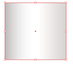
figure 15.1 Gradient Example 2
-
Reorder Layers now so that the Photo is first in the list, make sure that the positioning is right and select both the photo and the box and Group them. The easiest way to do this is to right click it. Your new object should look like this:
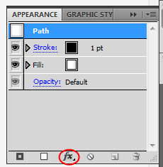
figure 16.1 Select FX button
-
Now that these are grouped, you can Rotate and reposition slightly off canvas, allowing for a look of a lot of pictures, even when you don’t fit them all on screen.
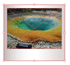
figure 17.1 Gradient Example 3
-
Repeat steps 1-18 for as many photos as you want to drop on the page.
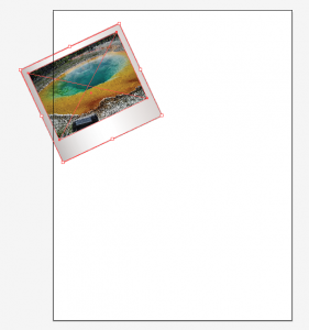
figure 18.1 Rotate and Reposition
-
Next, we are going to create a Mask to chop off the stuff that falls off of the canvas (you don’t lose it forever, it just adjusts what you can see).
-
Start by selecting the “Foreground” Layer again.
-
Select Box tool again and this time change fill color to Black.
-
Create small black rectangle in the center of the page.
-
Resize the rectangle to 612 px x 792 px (which is the same as 8-1/2in x 11in - you’ll memorize that soon enough if you don’t know it already).
-
Reposition this rectangle to auto-snap to the corner of the page. The result should be a black page with stuff sticking out from behind it.
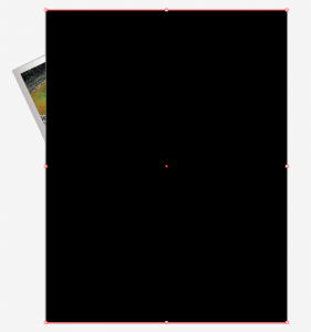
figure 24.1 Mask box
-
Back in the Layers panel, make sure this black rectangle objects is the first layer within your “Foreground” Layer.
-
Click on the “Apply Mask” button in the Layer Window.
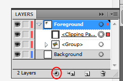
figure 26.1 Mask box
-
Viola! Now you should have a good looking start to your flyer. You can download the illustrator file to see it in more depth here: tutorial.ai
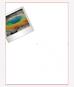
figure 27.1 Clipping Mask

Also, note that in the PDF that I gave at the beginning, the background is a yellow/brown color. This helps to differentiate it from the background some more. Just use the Gradient effects that you used on the picture on the “Background” layer above and you can have that as well.